
What happens when a late-night talk show host, a minor league baseball team, and a purple prehistoric mascot walk into a brand story? You get the Erie Moon Mammoths.
In a segment spotlighting minor league promotions, Last Week Tonight with John Oliver offered one lucky MLB team a full creative rebrand with one caveat: no input and no questions asked. “We are willing to use all of our resources and stupidity to give one Minor League Baseball team a total rebrand…We will even throw you a theme night. It will be personalized and it will be bespoke,” Oliver said on air on May 4.
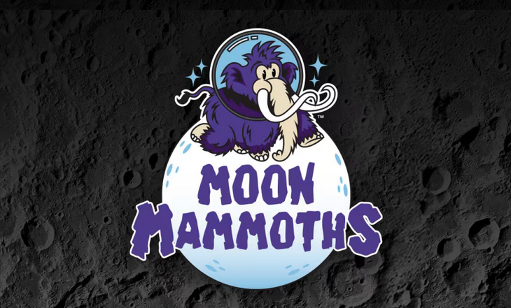
Out of 47 franchises that raised their hands, the Erie SeaWolves, a Double-A affiliate of the Detroit Tigers, made the cut — thanks to a strong pitch from General Manager Greg Coleman. What followed was a complete identity shift: a new name, a new look, and a new mascot. Meet Fuzz E. Mammoth, a purple mammoth who will be taking over on select game dates throughout the summer, with a special appearance from John Oliver on Saturday, July 19.
As expected, Erie had thoughts. Did the show do its homework on our city? Does the branding land with locals? Is this what representation looks like in the minor leagues?
With comments ranging from “As an Erieite, I *love* the rebrand,” to “No thank you. We are ERIE SEAWOLVES” the reviews were mixed. Not everyone was sold on the purple fuzzball, but everyone loved that Erie got the nod.
As a creative agency rooted in Erie, PA, we’re energized to see our city, and our local sports, in the spotlight. The SeaWolves’ transformation into the Erie Moon Mammoths may be temporary, but it’s a masterclass in how bold, well-executed ideas can capture attention and ignite conversation.
A Mammoth Marketing Moment
At kate & co., we know authenticity wins. There’s something powerful about a campaign that doesn’t take itself too seriously. The Moon Mammoth branding embraces silly charm, turning a quirky rebrand into a limited-edition moment Erie won’t soon forget.
The rollout leaned into comedy. It leaned into fuzz. And it worked. Social media is still buzzing, and national outlets from Sports Illustrated to NPR took note. It’s the kind of organic visibility most brands only dream of — made possible by a willingness to get a little weird.
We’re also experts in all things design: from typography to logos to color theory, and yes, even mascot aesthetics. @JohnOliver, didn’t you know? Moon mammoths discovered in the Great Lakes region are famously bubbly and fun-loving. If it were up to us, we would’ve gone with Hobeaux, an energetic typeface that matches Erie’s energy.
We do love the mascot — and we’re calling it now: purple is the color of the summer. From national brand campaigns to the fur of the Moon Mammoth, this bold swatch is showing up everywhere. We can’t wait to see the SeaWolves take the field at UPMC Park, trading their iconic red for a fresh shade of purple and black.
Beyond the design, we loved uncovering the story behind the new mascot and discovering a slice of local history. Here in Erie, our bond with the Great Lake runs deep, shaping much of our culture, industry, and storytelling along its shores. It was interesting to learn about the often-overlooked Lake Pleasant — a “minor league lake” living in the shadow of the great Lake Erie.
All in all, this rebrand is more than just a fresh look. It’s a celebration of Erie’s unique spirit, blending history, creativity, and community pride into one unforgettable mascot. The Erie Moon Mammoths have sparked a surge in community engagement and ticket sales, and kate & co. will definitely be in the stands to cheer them on.